Ruby is the main character of The Merlin Paradox, a bonkers arcanepunk novel about half-demons. How do you represent the relaxed fantasy feel, urban mood, young characters but serious themes all in one image?
Sometimes, the best solution is to draw it yourself. I highly encourage you to give it a try.
I kept the earlier scans of this drawing so you can see the evolution of the actual pencil drawing and the many different ways I’ve tried to colorize it (I use Krita app for this). I used pictures to guide me in the creation of the drawing. The following is a combination of ideas from several different stock photos with modifications to fit the themes of this story.
Feel free to use my ideas while brainstorming your cover.
When I was semi-happy with my drawing, it was time to see what it would look like on a cover.
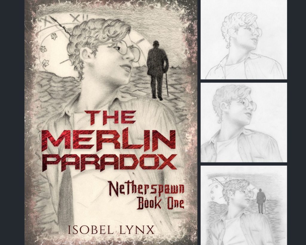
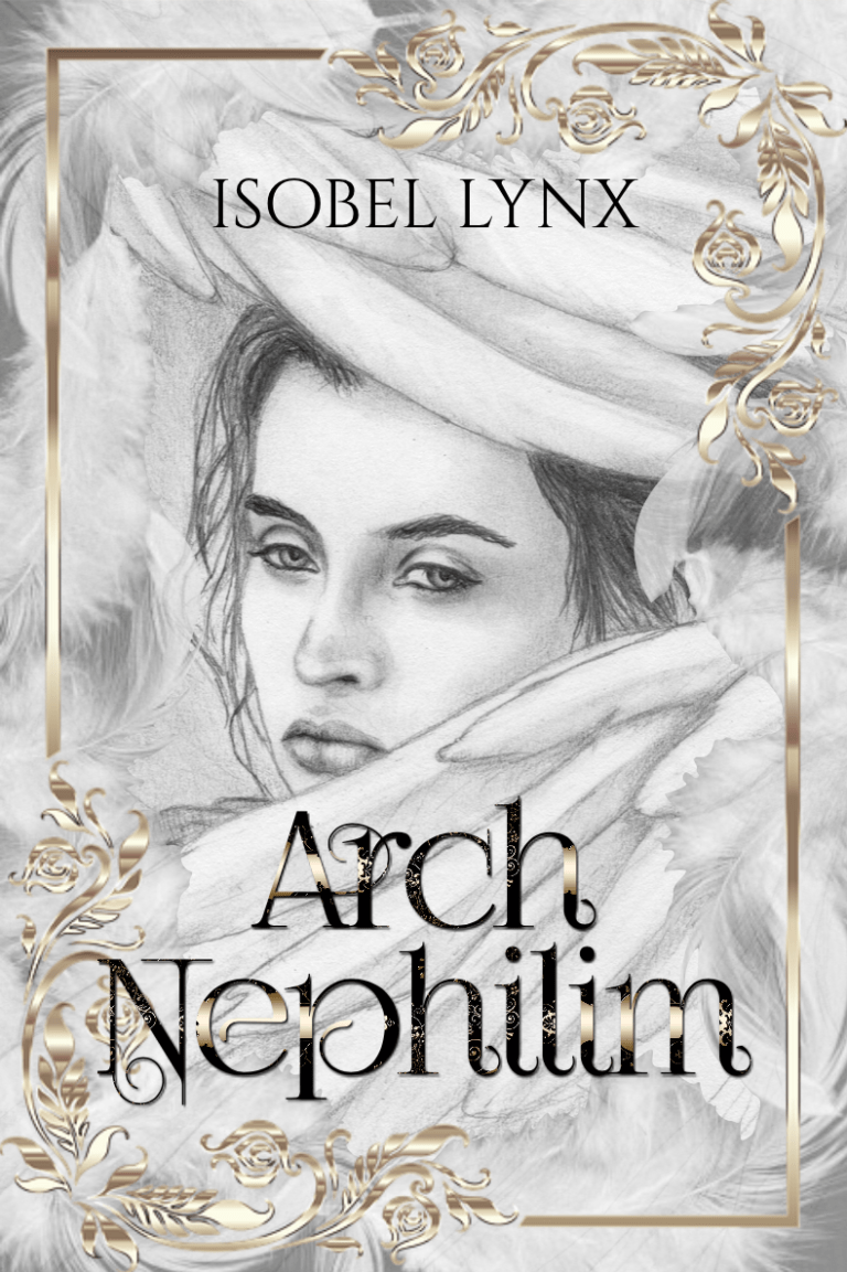
The first version of Ruby on the cover wasn’t bad, but pencil alone can be pretty flat – not exactly the eye-popping cover I had in mind. Even with a cool font, mysterious frame (made in Krita), and a sepia feel, it just couldn’t compete with vivid pictures normally used on covers.
I tweaked the drawing some more and put it in Krita app to add color to it (I don’t dare use colored pencils just yet). I found that the picture was a little grainy and the drawing needed touch-ups (where did those buck-teeth come from?). Back to the pencil it was.
After I added more pencil and scanned it at higher resolution, I started Krita experimentation again.
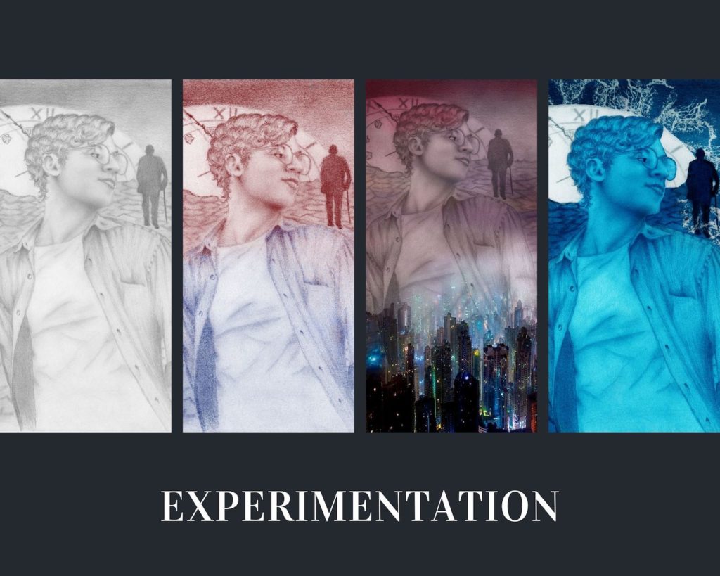
In the end, I was happy with the colors but noticed that the lines became blurry. So, I did a little trick back in Pages:
1. Increase the saturation of the colorized drawing.
2. Add the original pencil drawing on top of it – 50% transparent and with increased contrast to get the lines nice and dark.
3. The trickiest part. The images were not the same size. Getting them to match up was a pain.
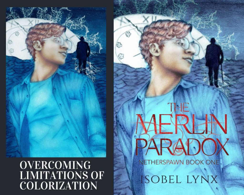
Do you think it was worth the trouble?
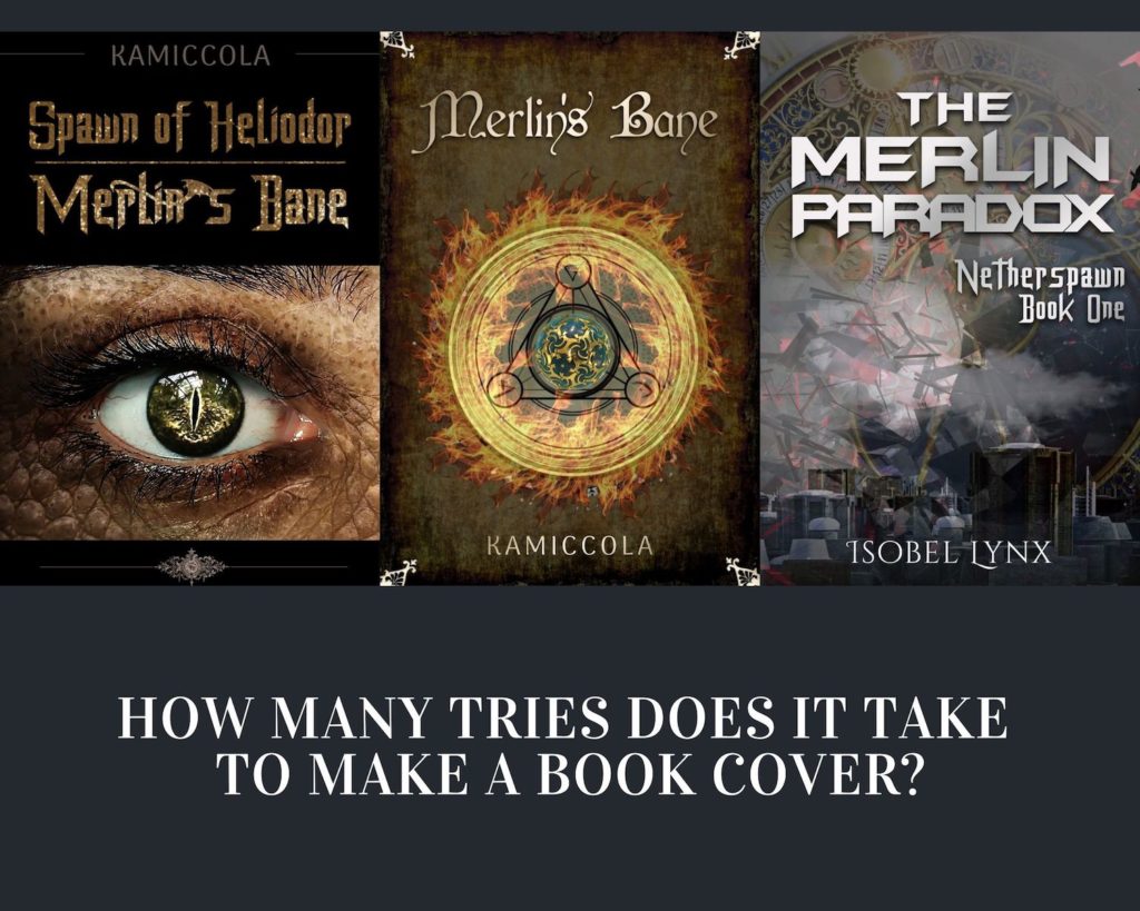
Early cover concepts for The Merlin Paradox 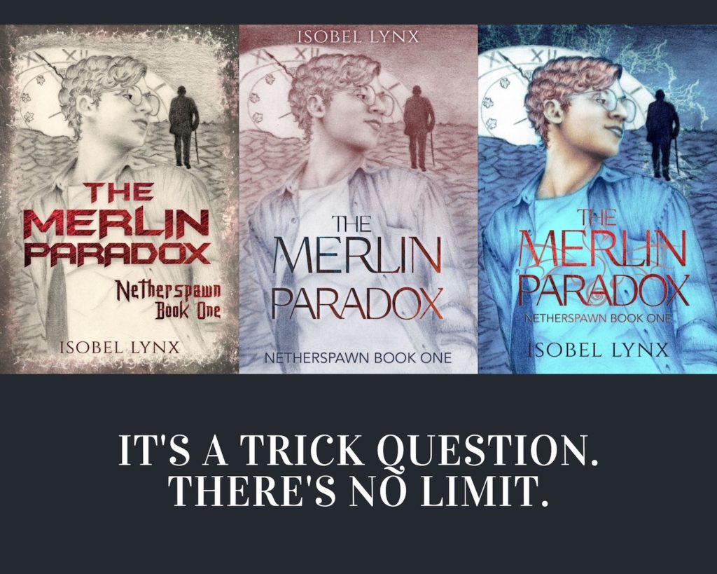
Hand-drawn cover concepts for The Merlin Paradox
Fun fact. This wasn’t my only attempt at drawing Ruby. I’ll work on the other drawings so they’re more presentable and will share them as well.


