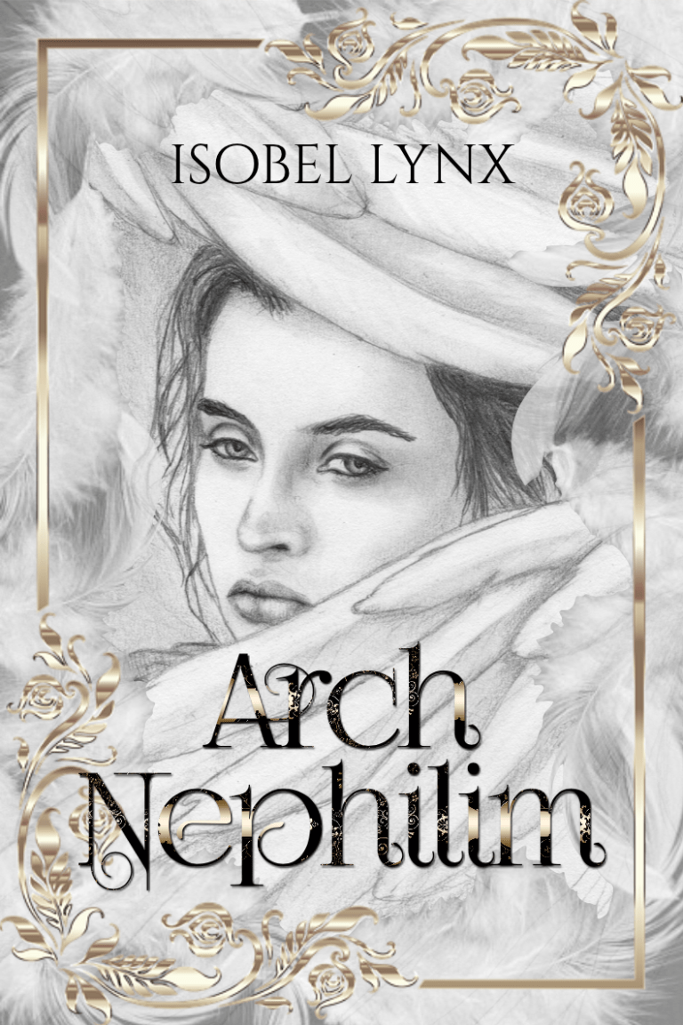
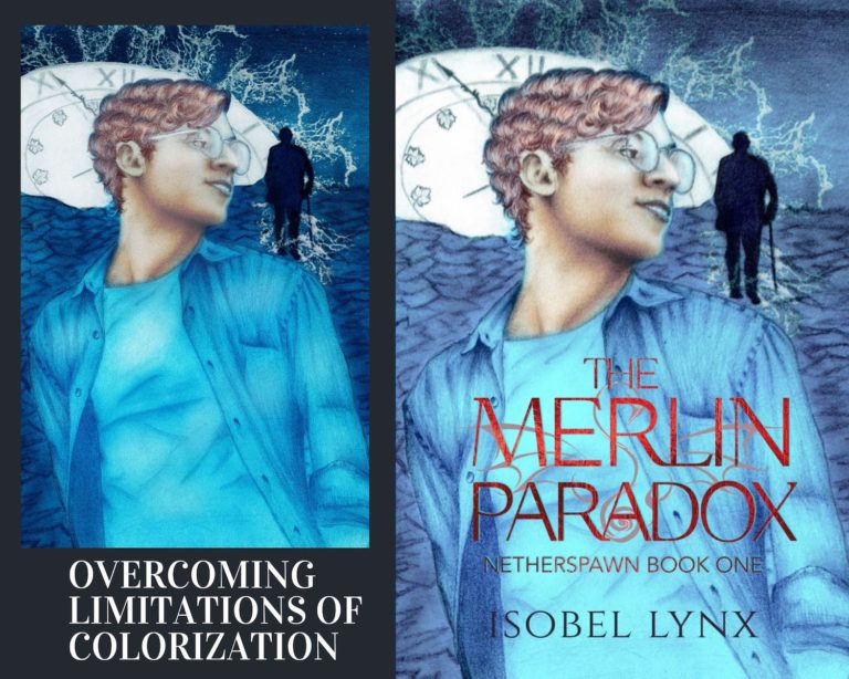
I’m not just a writer. I’m a creative. I dabble in different types of arts and sometimes they overlap. It comes in useful when I need to design graphics for my books, such as book covers or promotional content. I do it all myself because I can, and I enjoy it. If I have the ability to create my own book covers, why shouldn’t I?
The other day I crossed a new milestone. I’ve created hundreds of book covers by now, but this one is different because I successfully used my marker drawing to create a book cover artwork. I’d like to share with you the journey, the process that got me from the start to the finished piece, and the decisions that went into this design.
At the risk of exposing myself as an amateur, I’m going to show you the truth of what happened behind the scenes to arrive at the final illustrated book cover. If you’re currently wondering if you’ve got what it takes to do the same, I hope that this post will encourage you to give it a try.
Accessibility of art
Some might think that a paper drawing is not the right style or quality art to use as a book cover image, but here’s a secret no one talks enough about: just like books go through multiple drafts and get edited up the wazoo, so can art. What you start with and what you end up with can be far apart.
Art is editable
I believe that there is a glass ceiling when it comes to art. There is this misconception that you either have the mad talent to create masterpieces or you don’t, and that’s it for your hopes and dreams of being an artist. If beautiful art doesn’t just magically spawn from your talented fingers, then you’re not a true artist. Well, I call that a load of detrimental bull. This is the reason why so many people don’t even try, or they give up before they have a chance to improve.
I was in the latter group. I liked drawing as a kid, but I was discouraged because when compared to others, my skill came up short. My art taste was far more picky to produce art that was within my abilities. As an adult, I gave it a try again. I figured out several tricks of what works for me. Most important of them were:
- Using references, and
- Taking full advantage of my strengths.
While the first point is self-explanatory, my strengths were more elusive because, you see, I’m not one of those mad-talented artists who can cook up a masterpiece portrait for you on the city streets in mere minutes. I’m not an innovator with a unique style that sets trends and goes viral. But I’m persistent. Additionally, I’m an obsessive compulsive editor. And when I lean into those strengths, I can make up for my limited experience.
Great feats are born from great need
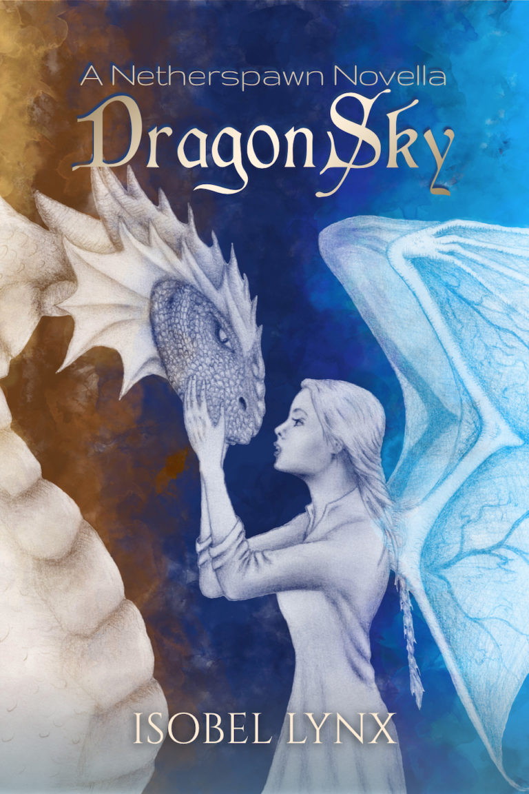
I wrote a new book this year, The Madman of the Woods, a vampire romantasy, and I wanted a cool cover for it. I don’t have a budget to hire an artist, besides, why hire someone when I can draw myself? I’m an amateur, but I’m not terrible.
I spoke about my art journey more in this post (in short, I’m learning how to draw with markers). The results have been pretty good so far, but a plain marker drawing, no matter how nice on its own, still isn’t good enough as is for a book cover, at least, not by my standards.
Here’s an example of using an unmodified drawing on a book cover.
The drawing quality is okay, the poses of the characters are good (they’re very true to the story, which is why I liked this drawing). It could use some color correction, but otherwise, it’s as good as I could draw. I’m happy with the art.
But when you put this drawing on a book cover, it’s missing something. It’s not quite good enough, and it most certainly does not look like a vampire book, does it?
My drawing art style seemed to be a drawback. So what did I do? I tried to do the best I could with what I’ve got. Let’s take stock of what I was up against and what strengths I could lean on to combat it.
My challenges:
My strengths:
When looking at my strengths, it seemed like I could overcome all limitations I was up against. I decided to give it a go. Here is what it took.
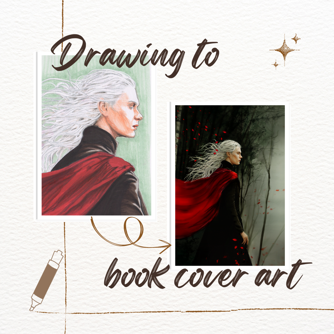
I tried to create a suitable drawing several times. You see, it couldn’t be just any drawing. It had to be something that would look good on a book cover.
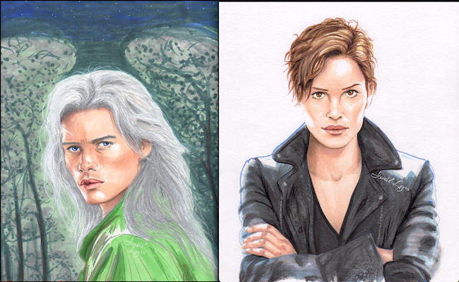
Let’s start from the main characters: the titular madman, vampire Lailoken, and a supernatural bounty hunter, Josie. The initial drawings were mostly just for myself to get a feeling for what these characters look like and if they had cover-worthy vibes.
Lailoken’s drawing came out not bad but… Well, you can see. I tried to draw a background because I thought his silver hair would look cool on a dark background but I absolutely suck at drawing trees. So please forgive the cringy forest.
And here’s Josie, the supernatural bounty hunter. I’m proud of how cool the jacket came out and the face is nearly flawless. It’s one of my best drawings yet. Notice that I gave up on a background.
I tried to draw both of them too (the cover you saw above). That one was pretty good for a cover structurally-wise. it’s also very true to the story with what they look like and what they’re wearing. I was just not 100% convinced about it. A cover with that drawing just didn’t pop like I’d like it to. Thankfully, I had an idea for another drawing. I wanted to lean into the supernatural setting of the book.
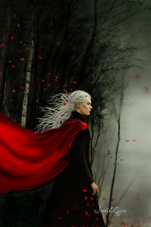
I’m hesitant to post the zoomed out version of it since it’s far from pretty, but in the spirit of sharing what things look like before you edit them, let’s show you my cringy trees again.
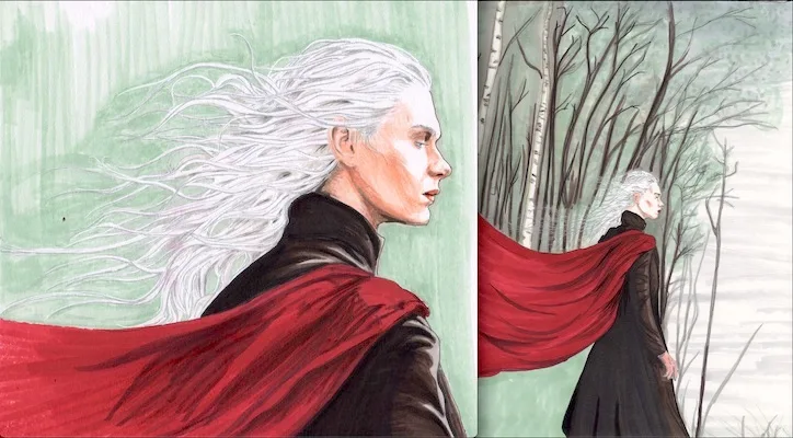
So, why the two drawings? I knew I could draw faces, but I wanted something more than a face on the cover. I wanted a scene: Lailoken comes out of the woods (that’s how the story begins). The red cape does not make an appearance in the story, but I wanted to color-code the book cover. More about that later. And I needed a large scene so I’d have space for my long title. However, I can’t draw a nice face at this scale. I’m just not that good at those fine details. I need to be zoomed in to draw face details and zoomed out to draw the entire scene (both of these drawings are on a full letter-sized paper).
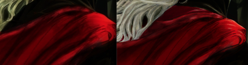
The face came out well. He looks a bit younger than what he’s supposed to, but it’s good enough. For the full-sized drawing I did better with trees than before, but I grew frustrated with my marker collection since I didn’t have the darker hues I needed (it’s supposed to be nighttime), but I love how the cape came out. That brilliant red is awesome. Btw, this red marker takes forever to dry. If you look at the close-up drawing, you’ll notice that I accidentally rubbed some of the red ink on his white hair. Oops. Lesson learned the hard way: protect the drawing from yourself by using a piece of wax paper.
Now comes the tricky part. How do you create a professional-looking cover art out of THAT?
Before diving deep into creating the cover art, I had to define what made art good enough for a book cover. I knew that my drawings weren’t there yet, but what exactly did they need?
Looking for covers of published books online is usually a good start, but in this case, it didn’t give me as much help as you’d hope. While my book is a supernatural fantasy and a vampire romance—a quite popular genre with lots of examples online—none of the covers out there use marker drawings (surprising, right? /s). The first cover with a drawing I shared with you above (Lailoken and Josie together) was born out of that research. I tried to create a similar pose as some of those other covers out there. Unfortunately, it doesn’t have the same effect when it’s not a picture.
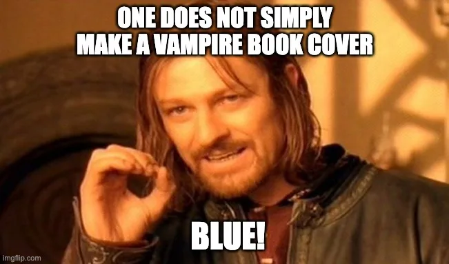
Then came a two-part trip to Barnes & Noble store, which gave me that final bit of inspiration. During the first trip, I was there shopping for a new vampire book (I’ve been binging through them lately as I’ve rediscovered my love for this genre). I’m sure that the store has hundreds of vampire books in stock, but I had a seriously hard time finding them. I expected the covers to make it obvious for me which book is a vampire story, but they were no help. I had to search deep and read the titles of everything on the shelves to spot something new to read. Finally, I found a vampire series ONLY because one of the books in the series had a “bite” in the title. The cover of the book I finally bought is just another of those covers with a hot shirtless guy. And it’s blue.
Blue.
No. Absolutely not.
A vampire book needs to be dark with bold red accents. That’s what would have made it easy for me to spot what I was looking for. I didn’t realize how much I was leaning on that assumption until I couldn’t find what I wanted to read.
That was an eye-opening moment for me. If other readers of vampire books are anything like me, then they’d have very clear expectations too. This experience convinced me what color scheme my book cover had to obey (red and black) so that readers would find my book. Every bit of a clue helps the book get discovered.
Practical book cover research
I returned to Barnes & Noble a couple of days later, this time with a clear goal of finding book cover inspirations. I’m very glad that I went there in person. Looking at books in person is a very different experience from looking at them online. When the bookstore’s staff curates the inventory and sets it up for me to discover, it makes a difference because online search algorithms aren’t that good at showing you good book covers. Popular book link doesn’t necessarily mean a good cover.
The following web story lists notable cool book covers I found during that trip along with a breakdown of what caught my eye in each one. Do you like them too? Have you read any of these? Let me know in the comments.
I also found a few covers that use illustrations—very few. Illustrations are usually used for middle grade, YA, or for feel-good, lighthearted stories, and that’s definitely not what my book is. But they exist and that’s good enough for me. It gave me more fuel to keep working on this project.
I noticed that the illustrated covers used a different typeface than all of the other book covers that use photographs or symbols. In comparison, one illustrated cover I found tried to use a serif font and it didn’t look as good as the others. So while the fantasy books might have strong font conventions, the type of an image used overrides those conventions.
Let’s recap what I learned from this two-part trip that’s relevant to my book cover.
Relevant lessons learned:
What are the focal points in my drawing? I think it’s two-fold. There’s the face, naturally, it draws the eye, and there’s the brilliant red cape (now you see why I chose a red cape even though there’s no such thing in the story).
Faces, btw, are important. I apologize as I don’t remember who to credit with this advice, but look at some examples of book covers and you’ll notice the wisdom of it. Essentially, a book cover that depicts an object or a scene but no people in it doesn’t draw eye as much as one that has the presence of a person. It could be a face or it could be silhouette, a hand, a shoe, SOMETHING that suggests people. Seeing it makes you relate to the person in the image, makes you wonder what their story is. It stirs curiosity and is the first window of opening to grab a reader’s attention.
I’ve used Krita for years, but when working on this drawing it became very clear that I know how to use about 5% of its features. And of course, I don’t have a drawing pad, which means that drawing anything requires serious finger gymnastics. It doesn’t stop me though. I edited that baby with my trackpad like a savage beast.
Here are notes about things I’ve done to this drawing to get the image to be cover-ready:
Structural work
First, I manually removed the background from the face drawing. I tried to do it with Krita tools at first, hoping it would do it for me, but that only created more work for me to fix (did I mention that I don’t know how to use Krita as much as I should?). Then I took that cut out and overlaid it on top of the full drawing to make the face line up with the rest of the body in a way that would anatomically make sense.
Later, I realized that my attempt at drawing longer hair was not working for me (the back layer of hair did not match the front layer), so I duplicated the face drawing cut out and cut out only hair out of it. In the end, I only used a little of that hair and drew a few strands manually.
Speaking of hair
Drawing hair took me the longest. After spending many, many hours, I decided that I hated it and started over. Then I found that my layers were a mess, and I had to undo/redo a lot of the work. Lots of lessons of what not to do learned from that experience. As of today, I’m still not 100% happy with that hair, but I have to let it go.
I now have about 5 hair-related paint layers (not including the actual drawings). It’s a little more organized but still far from pretty. People who say hair is easy to draw… I don’t relate.
The face
The face was quick, at first. I just did some color corrections and a few details and it was good to go. Except later when I asked for feedback on my art, someone mistook Lailoken for a woman. That was the second strike against the face (the first was that he looked too young). At this point, I had already put so much work into this drawing, I couldn’t just start over. Instead, I attempted to edit his face to make it more masculine. To my surprise, it wasn’t that hard. The tricky part was in getting my additions to match the color and grain of the original drawing.
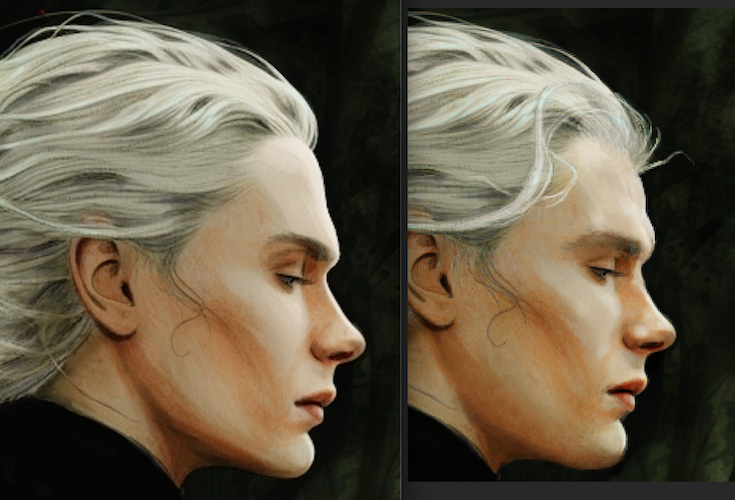
To make Lailoken’s face more masculine I had to drop the jaw a bit, make the brow less sculpted, and lastly, I changed the hairline which introduced another hair catastrophe as I had to match the previous hair work. Did I mention I hate drawing hair?
Clothes
I added a pattern to his robes and darkened them, but otherwise, I left them as is. At first, that is.
While trying to avoid the misgendering issue, I revisited the structural look of his body and wondered if his torso was too feminine. I had to go back to look at some reference photos of men standing (do not ask me to reveal my search history keywords, lol). Finally, I realized that his waist was too cinched. Men standing in that position usually go flat down from the chest (or are rounded). I pushed his waist a bit to create a straighter line, and it completed the misgendering fix. Yay.
I loved the cape from the beginning, but something was bothering me about it. I looked up some more images of capes and finally realized that this type of cape should have had a hood. I was pleasantly surprised by how easy adding a hood in Krita was. Compared to hair, adding extra clothing pieces was a piece of cake. Yay.
The background
The background went through a massive makeover. I significantly darkened the woods, I created some blurred effect to make it look a bit foggy. Fog is story-relevant so I’m happy to have been able to incorporate it into the drawing. I added more trees, branches and added little details. Quite late in the game I did what I should have done long ago—I downloaded new Krita brushes. I found some specifically for drawing leaves, and I am in love. They made such a difference.
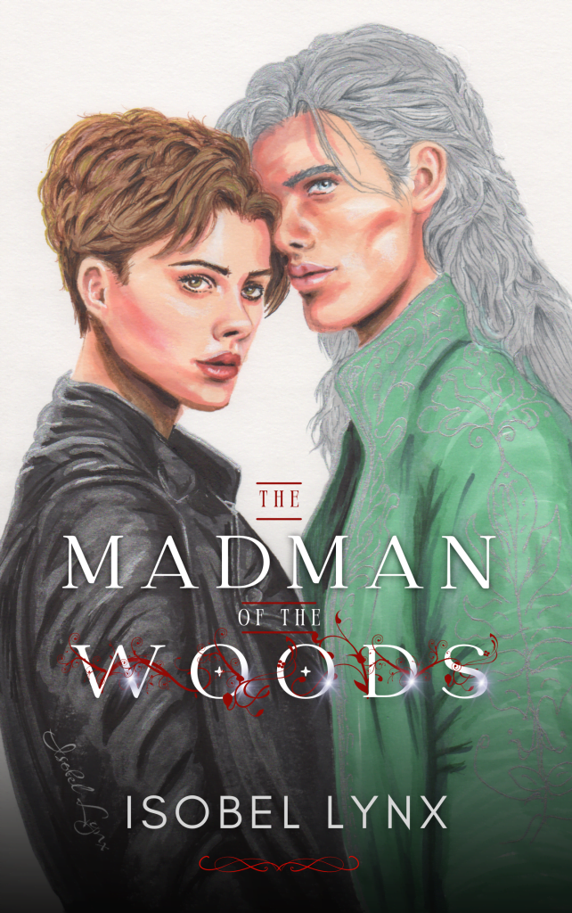
Here’s the resulting final image. Big difference from the marker drawings, huh? Yes, but also, it wouldn’t have been possible without them. Definitely not until I get myself a drawing pad.
I use Canva for my book covers. The font options are limited but you can’t argue with how easy it is to put things together there.
So what I did here: The title has a bunch of details on it that I’ve created a while back for an earlier cover version, but I changed the font to bulky handwritten one as per my B&N research above. I added a bit more leaf detail. Some shadow on top and bottom. I kept the image as is, no filters, but I flipped it. Why? Science.
When most people look at images, they subconsciously start from the upper left corner and continue at a diagonal to the bottom right corner. So the focal point of a book cover should be at the upper left section. Canva makes it easy to find the spot. Move or resize any image to see the grid or add one manually. Place the thing that’s supposed to draw the eye right around where the lines intersect. Additionally, the cape helps to continue the diagonal look so we can satisfy that part of the science.
And here is my final book cover.
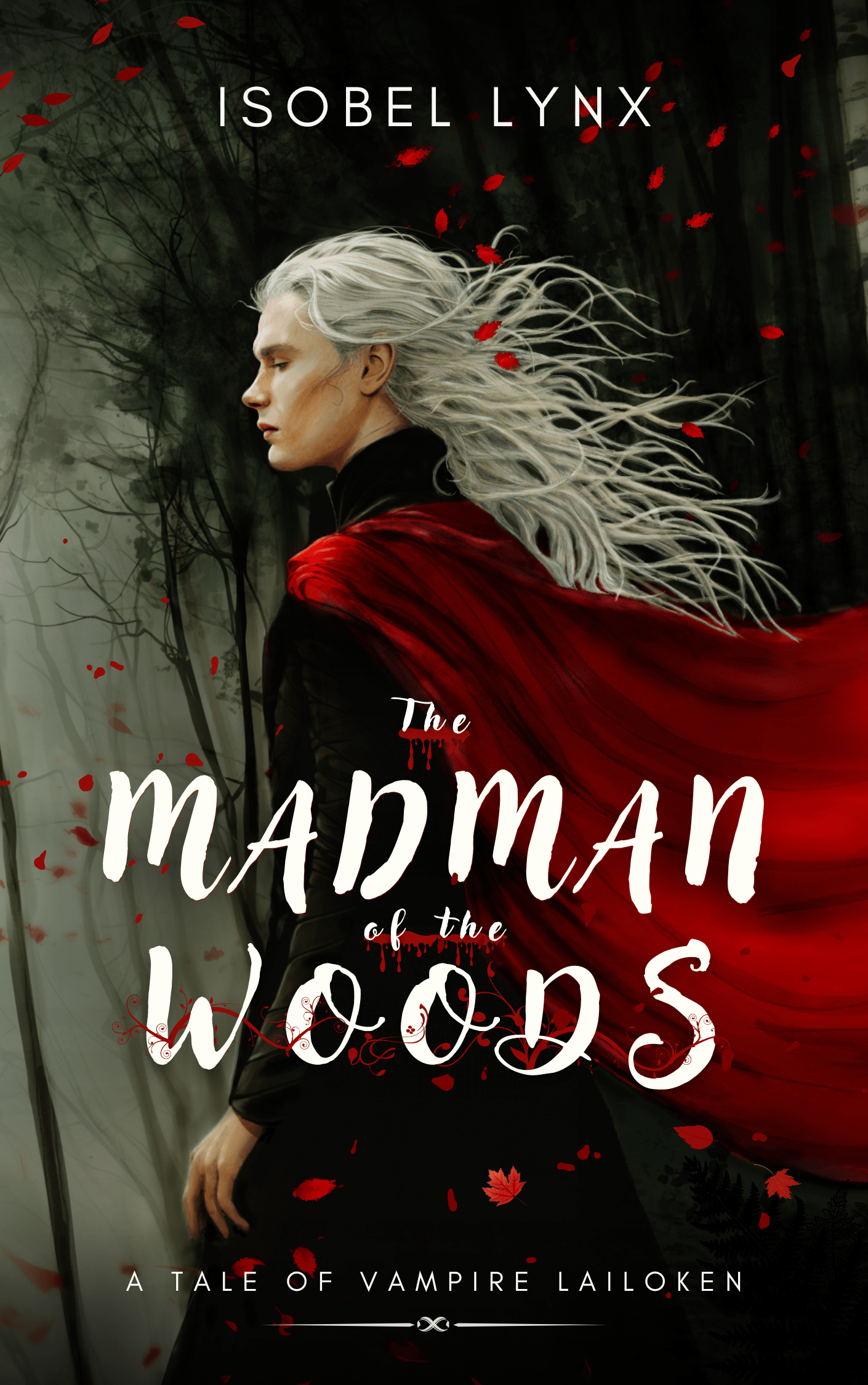
I think it was worth the effort. I’m still a bit amazed that I did that.
Are you a writer who draws their own covers? What has been your process like?
- Artwork
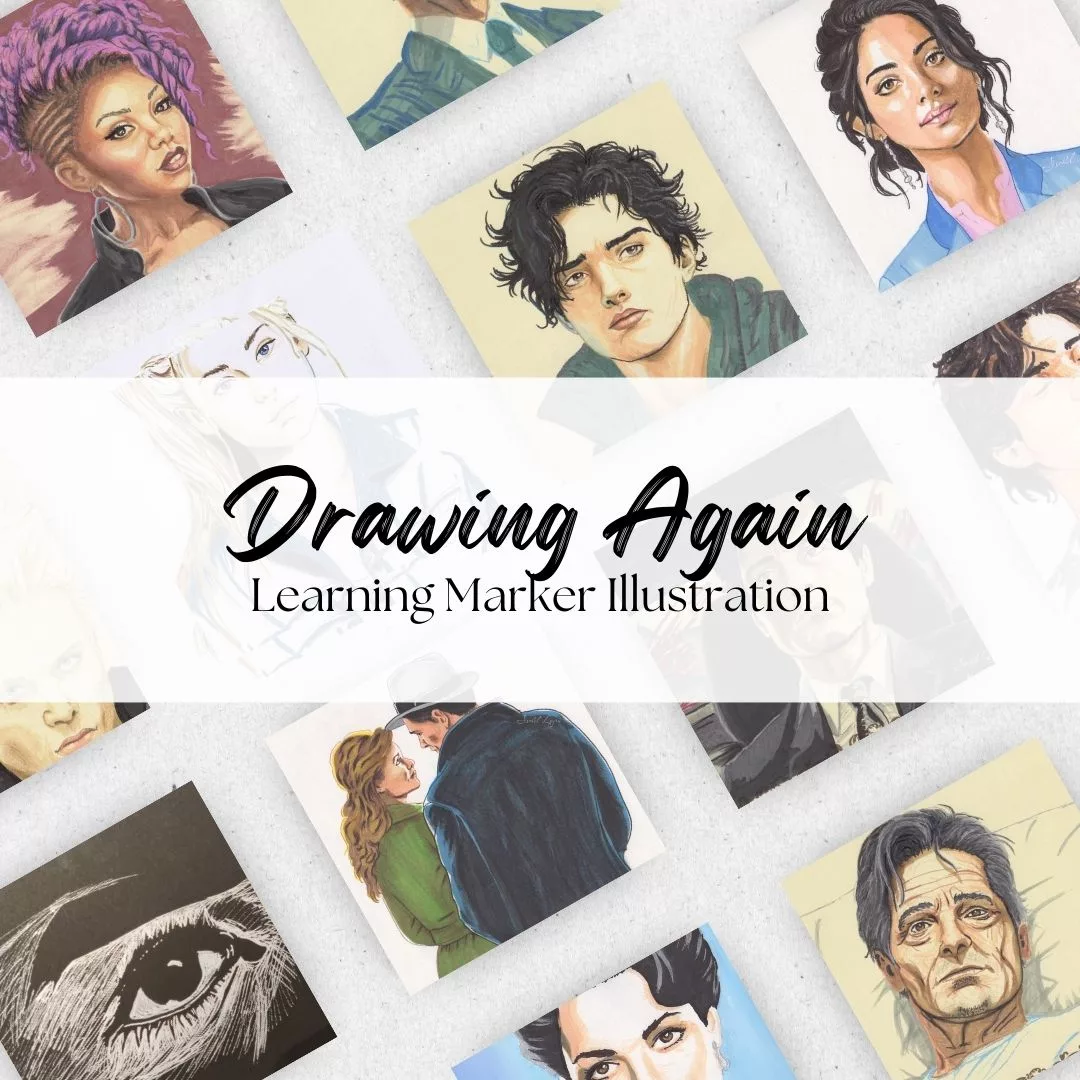
Pencil Sketches to Marker Illustration. How I Upgraded My Drawing Skill in Weeks
I rediscovered my passion for drawing, but using a pencil wasn’t enough. I started learning marker illustration and my hard work is paying off.
Writing in Sequences: the ultimate writing advice
Writing in sequences has improved my writing prowess but it isn’t being talked about enough.
My projects have found a cozy new home on Campfire Explore
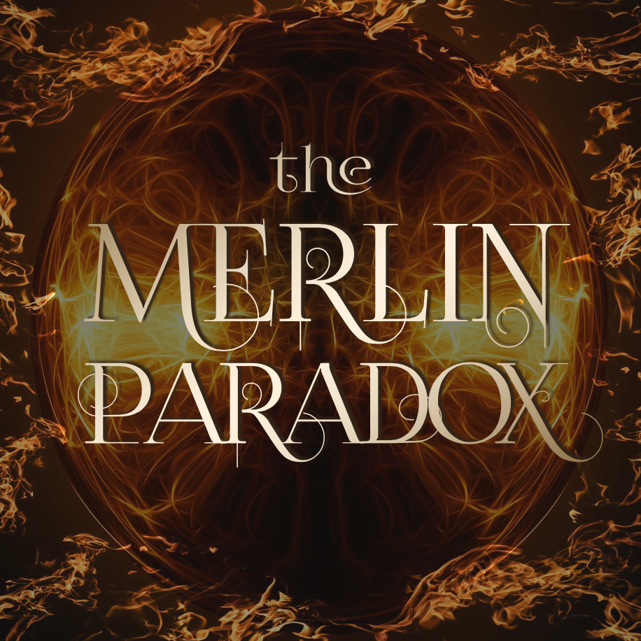
The Merlin Paradox is officially published on Campfire Explore, a very different online publishing platform.
2025 Goals: Finally, A Writing Goal That Fits My Life
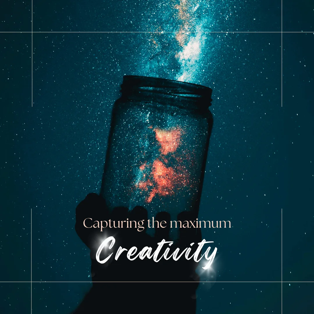
In 2025, I plan to shift focus from result-based writing goals to optimizing my time and capturing maximum creativity, addressing challenges like limited free time, burnout, and guilt. Join me
2024 Goal Tracker: It’s time to publish my books
I have ambitious goals for 2024. With plans for book releases, cover designs, and ongoing drafting and editing, I anticipate an eventful and productive year ahead.
Discover more from Isobel Lynx
Subscribe to get the latest posts sent to your email.