Charts in Google Sheets give us only one axis and multiple series to use. So what do you do when you want to show more static data values which you envision as a secondary axis?
Follow the steps below to discover several ways to get the result you want. First, we’ll look at a traditional sales chart, then, we’ll see a non-conventional use of this invaluable tool when we create a chart for a story arc.
The basics of charts in Google Sheets
Where numbers fail to tell the full story, charts and graphs pick up the slack.
To turn your data into a chart, first, envision what is the static data (by default, the X value) and what is the variable data (by default, the Y values). The static data will form your axis. The variable data will be the series – these are the values that will create your lines, bars, or pie charts.
To create a chart in Google Sheets:
- Prepare your data in a table format.
- Highlight your data.
- In the menu, choose Insert > Chart.
- In Chart Editor, choose what type of chart you want (line, bar, pie, dots, etc.), colors, formats, chart title, and other details.
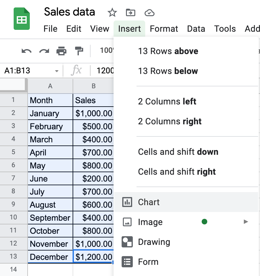

Notice that Google automatically used the first column as the X axis, second column as the series, and applied the first row and column as the labels for both. This can be further customized – we’ll discuss that later.
Adding more series to a chart
To see comparison or correlation in data, you can add more columns of variables to your spreadsheet.
If you add a new column, adjust Data Range in Chart Editor.
To bring back the Chart Editor, click the three dots in the upper right corner of your chart and choose Edit chart.
Here, we have to tell the chart to include data up to C13.
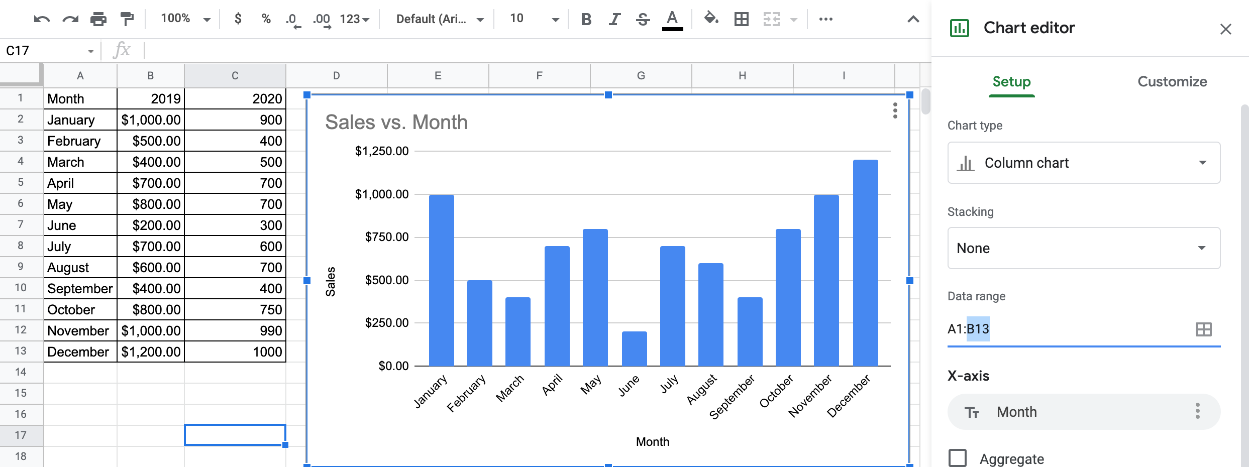
Now we’ll add a second series to include sales data from 2020.
The resulting chart has two sets of variable data (series). By default, Sheets automatically changes the series color and displays a legend. Those can be customized.
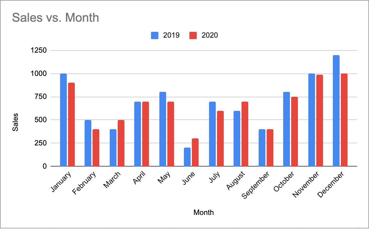
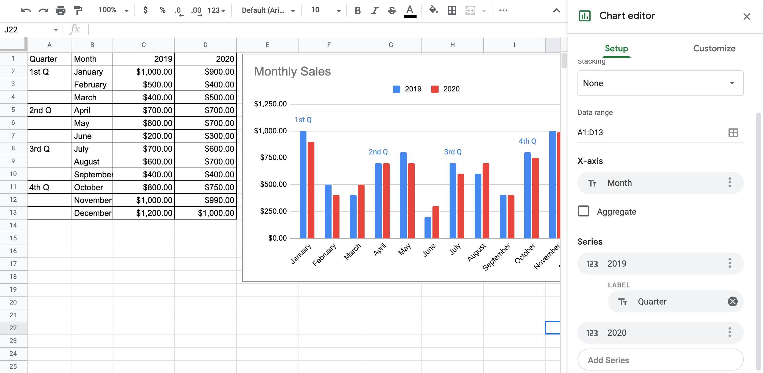
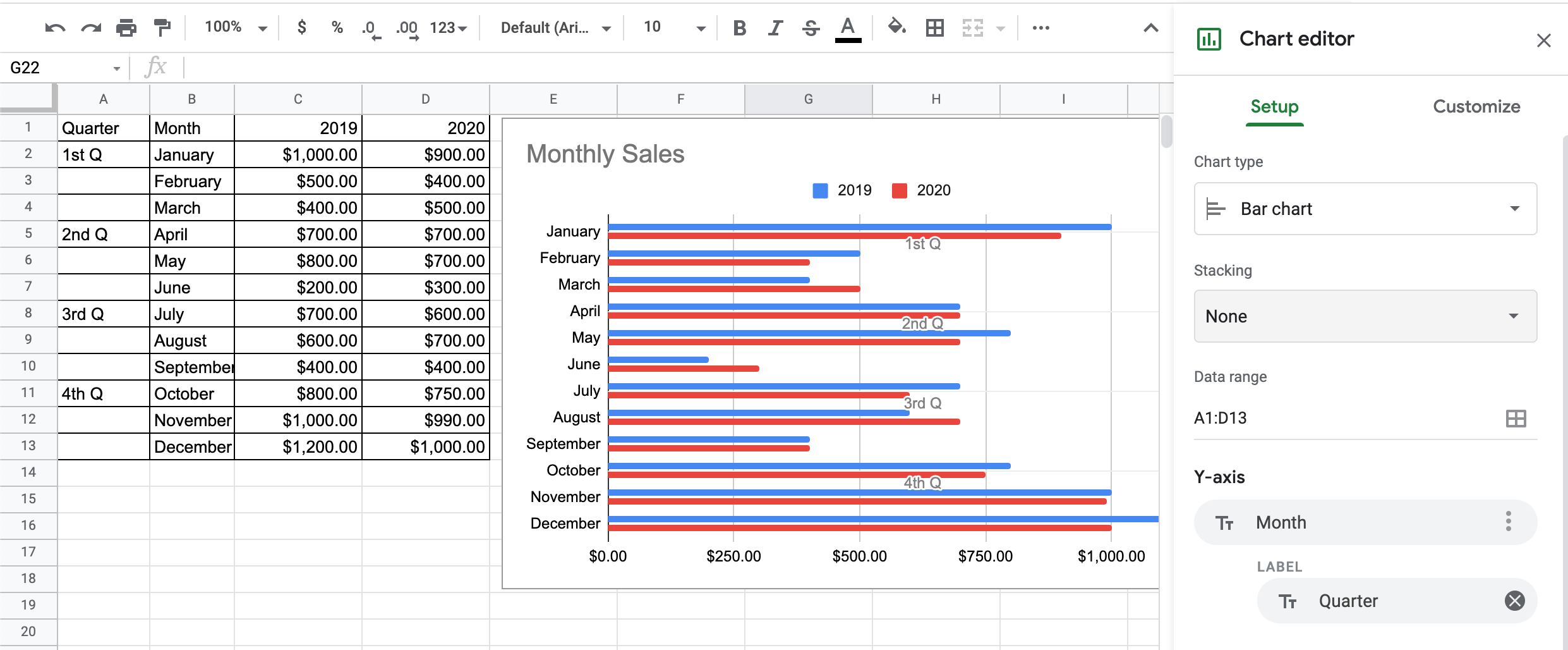
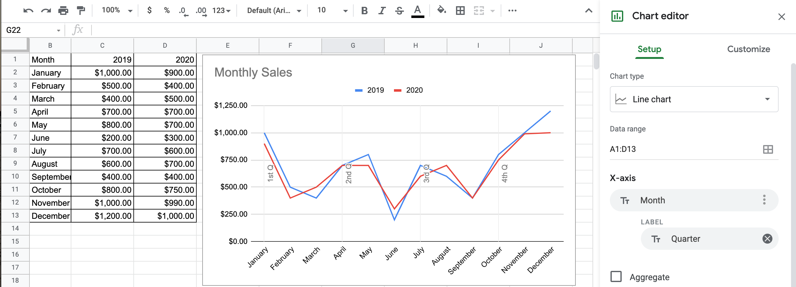
But this only gives us one static data (axis). What if we wanted to add more static data? For example, what if we wanted to separate our months into quarters?
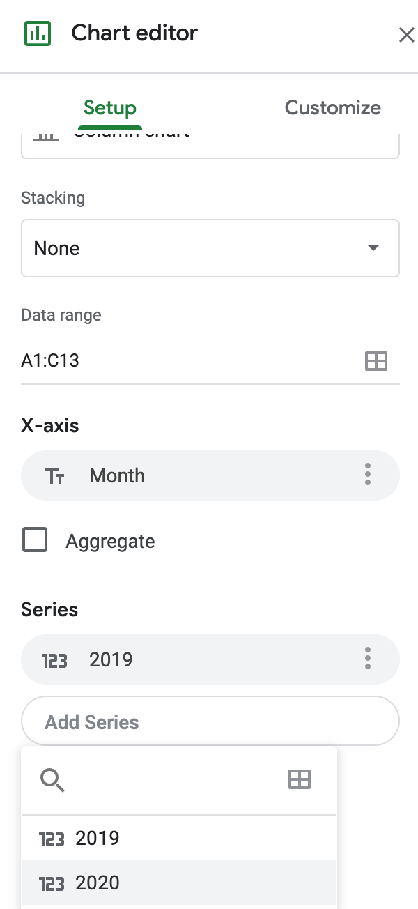
Adding labels
Labels are the secret to getting more data onto your chart. You can add a label to the axis or to the series. Experiment with a few layouts to get the look that you prefer.
Click the three dots by X-axis or by Series to add a Label. By default, it will look for an unused text column but you may change it to a different one.
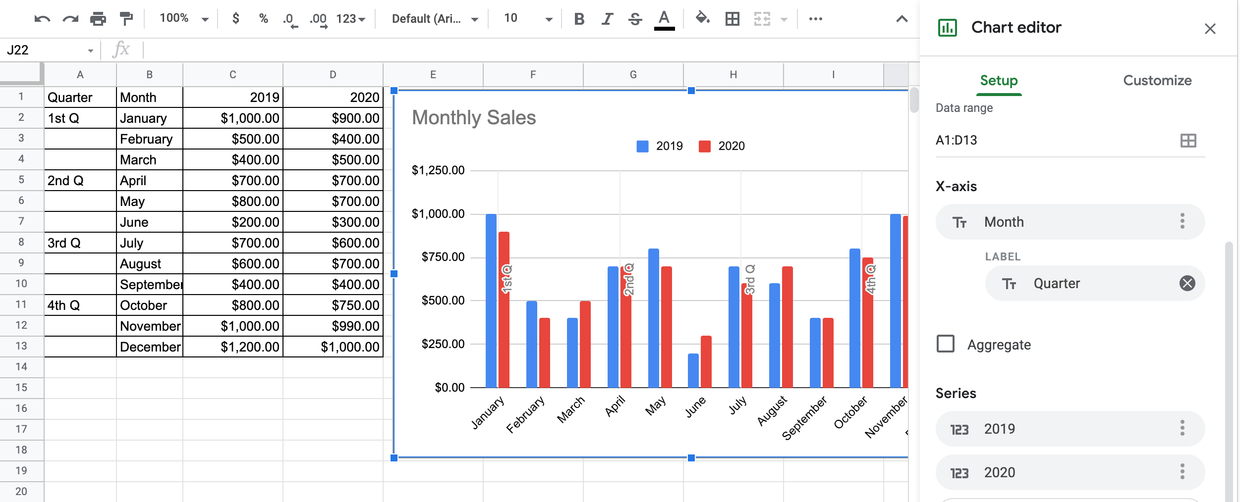
The following are four different ways to view the same sales data. I put the Quarter name in every first month of the Quarter column to simplify the visual. Notice the difference when you put the Label on an axis or on the Series. Click on an image to zoom in.
Let’s customize it, to make it even more visually appealing and easier to understand.
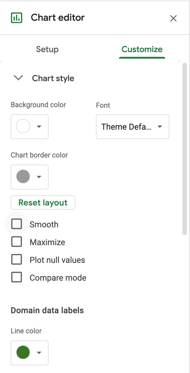
Using Chart editor, you can customize your chart further.
Here, to make a distinction between the quarters, let’s change the vertical line color under Chart style.
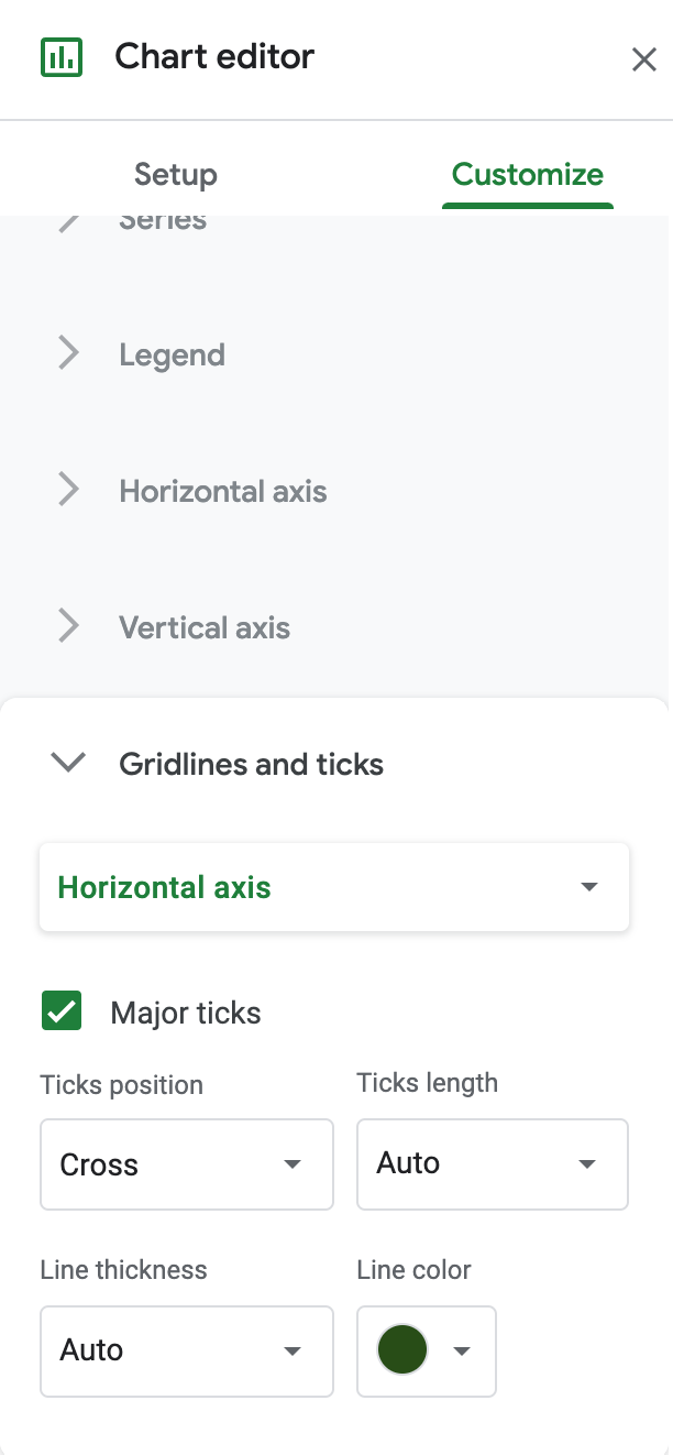
If you want to change the horizontal line color, look under Gridlines and ticks. Here, I left them the default gray but added major ticks for horizontal axis and vertical axis.
The resulting chart has two variable data sets (sales data over two years) divided into two static types of data sets (months and quarters). It allows me to view the data as if I had two axis.
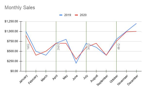
As you’ve seen, even though Google Sheets doesn’t give us an option to add a secondary axis, using the label options achieves similar results. Try it yourself and feel free to get creative with your customizations.
What else can we do with Google charts?
Now that we’ve unleashed our imaginations, let’s do something cool.
Can you represent a fictional story as a graph? You most certainly can. Why? Just like we can use a chart to analyze boring sales data, we can use the same visual tool to analyze the progression of a story.
How? Look at it from the same point of view as a sales chart. What is the variable data and what is the static data?
Every long-form story is divided into predictable units: chapters or scenes. That’s your static data which will form our axis.
The variable data that we can track is the story arc. Let’s take a very universal story: the love story. Emotions between the two characters will vary from scene to scene. In some parts of the story they could be indifferent to each other, they could be enamored or even hate each other. If you give each emotion a numerical value, you will find that you now have data that can be represented in a chart.
Here’s a chart I created for my novella in progress.
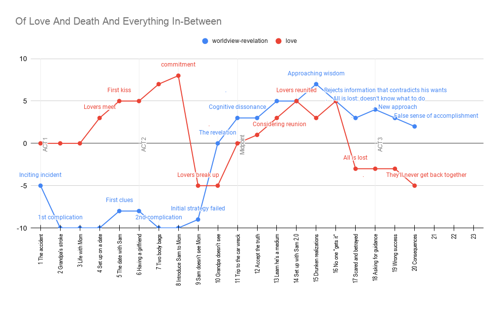
I’ve included two story arcs (Worldview and Love) as two series. The primary axis is made up of chapter descriptions. The secondary axis (label) showcases where each act of the story begins.
Why create a chart like this? It helps me spot issues. For example, as you can see, I expect the book to have at least twenty-three chapters but my midpoint falls on chapter 11, which means that when I go back to edit, I have permission to add a chapter in the beginning if I want to. I intend to finish the story with both lines as close to +10 as I can get them, which is equivalent to “wisdom” on the worldview scale and “intimacy” on the love scale.
Stay tuned for the next article which will show you how you can create a chart like this for your writing project.
Did you find this article useful? Let me know in the comments.
Discover more from Isobel Lynx
Subscribe to get the latest posts sent to your email.